

Table of contents
Introduction
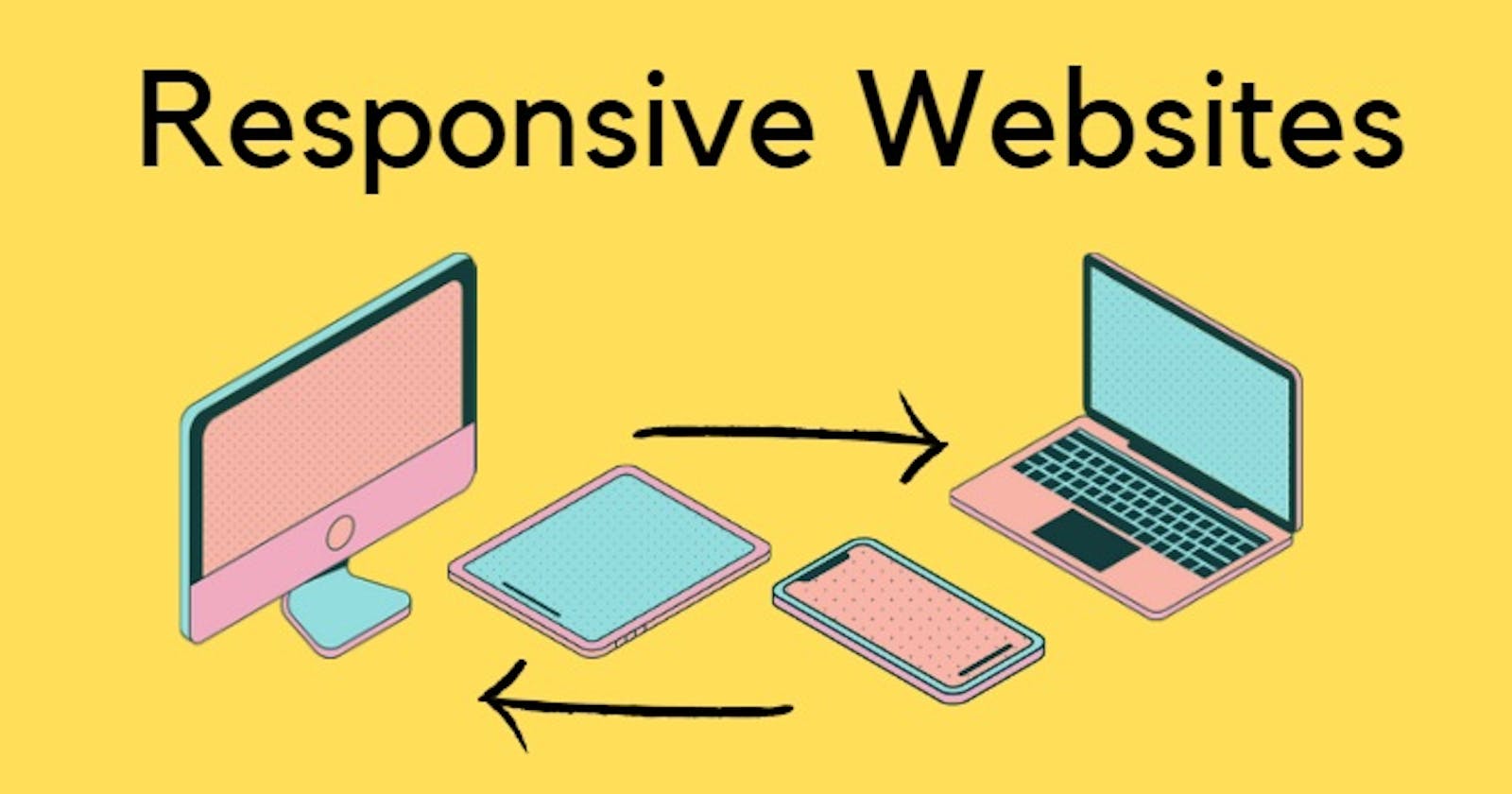
Creating a design that looks good on all kinds of screens is a cherry on the cake for the developer as well as the user. Thinking How?
Let me tell you. The Developer's job gets easier and the work is reduced to half if they build a responsive site, as they don't have to create a different piece for every screen size. On the other hand, even the users don't have to scratch their heads after opening a desktop-specific website on a mobile phone and vice-versa.
Let's first look into very basic terminologies related to the responsiveness of websites
UX : User Experience
User experience is a look and feel of a website given to the user by a developer using various design schemes. In other words, it is how a user is interacting with a website and the kind of experience he's getting.
HCI: Human-Computer Interaction
Human-Computer Interaction is how a human is interacting with the system/computer. In our case, apps, games, and websites.
A Good design
A good design is always
- Useful: Should be useful to the user, in a way that it only has meaningful features and not something which is not needed.
- Understandable: It should be easily understandable by the user. Instead not something which takes a lot of time to just understand how a feature works.
- Innovative: It should be introducing new ideas and feature new methods along with original and creative thinking.
- Aesthetic: It should be expressing the beauty of the idea.
Design system
The design system consists of a pattern of
- Colors
- Typography
- Space and sizing
- Grid System
Every website is designed using a different pattern of these design systems. Different colors, typographies, spacing, and sizing are used to enhance the look and feel of a website.
There are mainly 4 types of colors on a website: primary color, secondary color, CTA(call to action) color, and Accent color. And there are 3 ways of choosing those colors:
- Analogous color scheme: Adjacent colors in a color wheel
- Monochromatic color scheme: Tones and shades of a single color.
- Complementary color scheme: Colors on the opposite hands of a color wheel
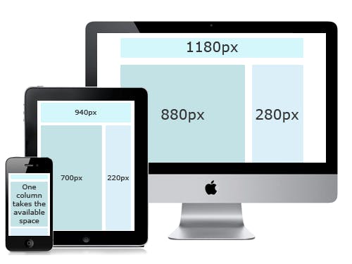
Responsive design
How do we create a website that looks good on all screen sizes?
Old approach: By creating different style sheets for different screen sizes. Or by creating a completely new website for each size.
Responsive design: Create one website and stylesheet which is able to respond to different device sizes and features.
Responsive Design and Media Queries
Media Queries- This allows us to modify our styles depending on particular parameters like screen width or device types. We can restyle a component, remove it, show or hide any component, change its size, or move a component from row to column layout.
/* this will work for screen sizes having width more than 600px(600 and above)*/
@media (min-width: 600px) {
  body {
    border: 4px solid red;
    color: red;
  }
}
/* this will work for screen sizes having width less than 500px(0 to 500)*/
@media (max-width: 500px) {
  body {
    border: 4px solid blue;
    color: blue;
  }
}
/* this will work for screen sizes having width exactly 600px*/
@media (width: 600px) {
  body {
    border: 4px solid blue;
    color: blue;
  }
}
We use max-width and min-width for specific purposes. max-width is mainly used for desktop first websites and min-width is used for mobile-first websites. Let's define these terms more precisely.
Mobile-first websites
These websites are built for mobile users and then designs are adjusted for the desktop size.
@media (min-width: 500px) {
  body {
    border: 4px solid blue;
    color: blue;
  }
}
@media (min-width: 1000px) {
  body {
    border: 4px solid red;
    color: red;
  }
}
Here, we style the whole website for smaller screens. Then, try to adjust the styles for screen sizes having widths of 500px and more. Later we change the styles for screens having a width of 1000px and above.
Min-width of different screen sizes along with the media queries
Small devices - (landscape phones - 576px and up)
@media (min-width: 576px) { ... }
Medium devices - (tablets - 768px and up)
@media (min-width: 768px) { ... }
Large devices- (desktops - 992px and up)
@media (min-width: 992px) { ... }
Extra large devices - (Large desktops - 1200px and up)
@media (min-width: 1200px) { ... }
Desktop-first websites
Similarly, These websites are built for desktop users and then designs are adjusted for the mobile size(smaller screen sizes).
@media (max-width: 800px) {
  body {
    border: 4px solid blue;
    color: blue;
  }
}
Styles are decided for the larger screens, Later changed for the screens having widths less than 800px.
Max-width of different screen sizes along with the media queries
Extra small devices - (phones in portrait orientation - less than 575.98px)
@media (max-width: 575.98px) { ... }
Small devices - (landscape phone - less than 768px)
@media (max-width: 767.98px) { ... }
Medium devices- (tablets - less than 992px)
@media (max-width: 991.98px) { ... }
Large devices- (Desktops - less than 1200px)
@media (max-width: 1199.98px) { ... }
Every project is started, thinking a mix and match of both desktop-first and mobile-first approaches. If there are fewer changes to be done in mobile, then we go with a desktop-first approach and vice versa.
Responsive Images
Why Responsive images?
Using the same image for different modes, resolution, density, and screen size can create an issue as it might look good on the desktop but expand and cover the entire viewport height on mobile screens. Or the content of the image(if any-> trees, plants, humans) can be blurred because of the size of the viewport.
How do we create responsive images?
Art direction problem
- In this, we display the cropped version of an image which only displays the important details of the image, when the site is viewed on the narrow screen.
- Basically, serving different cropped images for various layouts is called art direction problem.
- This is done using a wrapper element
<picture>, which contains several<source>elements that provide different options for the browser to choose from.<picture> <source media="(max-width:800px)" srcset="img_coffee.jpg"> <source media="(max-width:650px)" srcset="img_tea.jpg"> <img src="img_lemonade.jpg" alt="beverages" style="width:auto;"> </picture>
Resolution Switching
- Embeding large images for smaller screens would end up wasting a lot of bandwidth. Similarly, a small image would look grainy when displayed larger than its original size. Resolution switching is introduced to overcome this issue.
- Resolution Switching means based on the resolution of display, browser will decide the image to be displayed on the screen.
- Multiple resolutions can be made available to the users web browser . The browser can then determine the optimal resolution based on the screen size of the user.
srcsetalong with thesizeprovides the additional source set of images to the browser to pick the best image according to the resolution.<img srcset="sunset-320w.jpg, sunset-480w.jpg 1.5x, sunset-640w.jpg 2x" src="sunset-640w.jpg" alt="Gloomy sunset">- 2x means, If the device has a higher resolution of 2 device pixels per CSS pixels or more then
sunset-640w.jpgwill be displayed by the browser. And similarly with 1.5x and other resolutions.
Density Switching
- Density Switching means based on the density of the user's device, browser would switch the image.
- Density of a screen will be based on the pixel per inch(PPI).
- For the images which has a larger pixel density, we need to use images with more resolutions.
Responsive images in CSS
In HTML, we displa images wrt to the <img> tag. Whereas, in CSS we use responsive images in terms of background-image property.
.img {
  background-image: url(example-image.jpg);
}
@media(min-resolution: 192dpi) {
  .img {
    background-image: url(examples-image-768.jpg);
  }
}
Here, dpi is dots per inch.
Responsive Layouts
Flex and Grids are used to create responsive layouts. You can read more about them on
Flexbox
Grids
Wrapping up
We learned about how to make our website responsive. It's not important to use all of these responsive design techniques at once, but would be great if we keep all of them in mind while designing any website.
- Want to continue this discussion? Or have any feedback for me? Let's connect on Twitter, or write to me at kumsomi.5@gmail.com. Thanks for reading.
Until next time, take care.