

Table of contents
- 1. Using positions with margin
- 2. Using position with margin and inset value
- 3. Using positions with transform property
- 4. Using Flexbox: justify-content and align-items properties
- 5. Using Flexbox: justify-content and align-self property
- 6. Pairing flexbox with auto-margin
- 7. Grids and their properties
- 8. Grids and place-items properties
- 9. Grids and self properties for the child div
- 10. Grids and place-self property
- 11. Grids and auto margins
- Resources
- Wrapping up
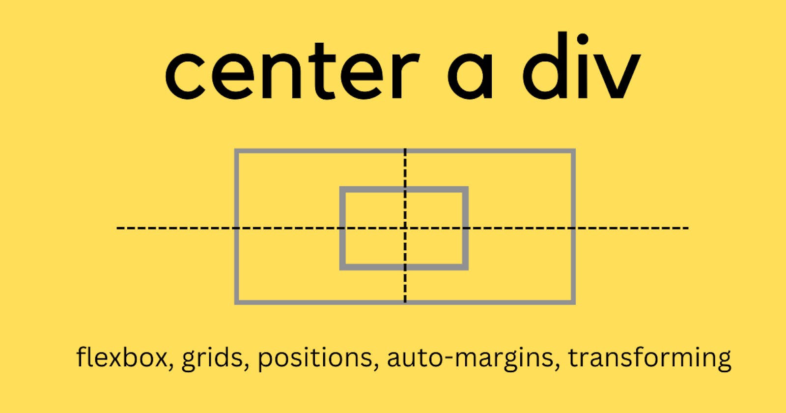
Every time I center a div in a project, I just go with the flow and follow whatever rule comes to my mind. Flexbox, grids, positions, transforming the translations, adjusting the margins, or maybe something else. So, why not write down the ways to center a div and follow this article whenever needed.
Let's first create a small HTML template to follow through.
<div class="parent">
    <div class="child">
    </div>
</div>
If you are using React, just change the class to className and you are good to go.
<div className="parent">
    <div className="child">
    </div>
</div>
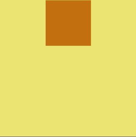
1. Using positions with margin
The first and easiest method would be to use positions.
Using relative positioning for the parent div means, We are placing our child div relative to the parent. If we don't give any position property to the parent div then, the child div would get placed wrt the root element or the body of the HTML document.
In order to make the child div leave its normal document flow completely, we use absolute positioning and then place it according to our need using top,left, right and bottom attributes.

In the end, we have used margin:auto which will automatically place the child div in the center, leaving equal margins on all the sides.

.parent {
  position: relative;
}
.child {
  position: absolute;
  top: 0;
  left: 0;
  bottom: 0;
  right: 0;
  margin: auto;
}
2. Using position with margin and inset value
This solution is same as the previous one. Over here, we are just using shorthand property named inset to give the top, left, bottom, right values. inset: top right bottom left.
.parent {
  position: relative;
}
.child {
  position: absolute;
  inset:0;
  margin: auto;
}

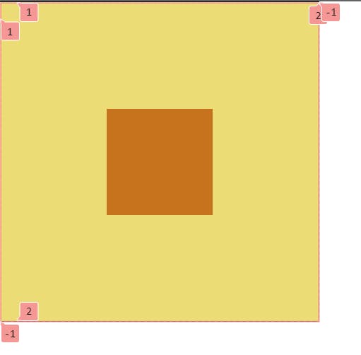
3. Using positions with transform property
Child div can be adjusted by setting top and left attributes to 50%. But this, would place the top-left corner of the child div at the center.
In order to correct this alignment, we can use transform:translate() property and move the element horizontally and vertically by -50%.

.parent {
  position: relative;
}
.child {
  position: absolute;
  top: 50%;
  left: 50%;
  transform: translate(-50%,-50%);
}
4. Using Flexbox: justify-content and align-items properties
Flexbox is used to align its components on the horizontal and vertical axis.
justify-content property is used to align the components on the main axis. By default: the main axis is the horizontal axis. align-items property is used to align the items inside the container on the vertical axis.

.parent {
  display: flex;
  justify-content: center;
  align-items: center;
}
5. Using Flexbox: justify-content and align-self property
align-items would align all the child elements. But align-self is used when we have to align only one child element.
align-self: center would be given to the child div. align-self: center is also used to override align-items property.
.parent {
  display: flex;
  justify-content: center;
}

.child {
  align-self: center;
}
6. Pairing flexbox with auto-margin
margin-left: auto property on child div will push the child element towards the right.

margin-top: auto property on child div will push the child element towards the bottom.
Vice-versa in the case of margin-right and margin-bottom as well. Let's recollect all this to push the child element towards the center. If we set all the margin-position to auto, then child div will extend its margin in all directions placing the element in the center.
.parent {
  display: flex;
}
.child {
  margin:auto;
}
7. Grids and their properties
Flexbox is one-dimensional, it works with vertical and horizontal axis whereas, Grids are two-dimensional and they work with rows and columns.
justify-items: center would center the child along the row axis.
align-items: center would center the child along the column axis.
Applying both properties together to get the result.

.parent {
  display: grid;
  justify-content: center;
  align-items: center;
}
8. Grids and place-items properties
place-items is a shorthand property for align-items and justify-items.
.parent {
  display: grid;
  place-items: center;
}
9. Grids and self properties for the child div
align-self and justify-self properties can be used to displace only a particular child element.

.parent {
  display: grid;
}
.child {
  align-self: center;
  justify-self: center;
}
10. Grids and place-self property
place-self property works the same way as place-items. But, this is a child's property unlike place-items which is a parent's property.
.parent {
  display: grid;
}

.child {
  place-self: center;
}
11. Grids and auto margins
Flexbox consumes space in the container, whenever we set the auto margins to it.
Whereas, Grids consumes space in the track and not in the container. But, as we place our content inside the track it automatically pushes the child into the middle of the track. In the given scenario, we only have one track.
.parent {
  display: grid;
}

.child {
  margin: auto;
}
Resources
Resources to read more about these topics:-
Wrapping up
We learned about centering a div and million other ways to do it(which we actually have to recall every time we need to center a div 😅). But, it's okay. Keep this article handy in case you don't want to search for the same thing again and again.
Want to continue this discussion? Or have any feedback for me? Write down in the comments below.
Let's connect on Twitter, or write to me at kumsomi.5@gmail.com.
Thanks for reading.
Until next time, take care.